
United Nations report series
Making Access Possible (MAP) is a multi-country initiative by the United Nations Capital Development Fund (UNCDF) to support financial inclusion through a process of evidence-based analysis. The research outputs are published as a report series and I was tasked with creating the visual identity and design system for the 2020-2021 MAP output.
PRIMARY TOOLS= INDESIGN + ILLUSTRATOR + PHOTOSHOP
DURATION = LONG TERM CONTRACT

CHALLENGE
Each research report includes dense text which is supported by data charts and graphs. The content is collated for design as an edited text document which needs to be reformatted as a visually engaging and accessible output. Added to this the design needs to convey the impact and importance of the research for presentation to stakeholders. As a series the design must be distinctive, but similarly it needs to align with the broader UN brand guidelines.
DESIGN APPROACH
The design approach for this project is to deliver products that feel human and approachable. To achieve this an illustration style is used that breaks from the very corporate and sterile style that has become synonymous with research publications. Handmade textures and line work was integrated, adding an organic feel to the page design.
The cover design for each country report featured an illustration of their international flower, expressed using a restrained colour palette that was inspired by that country's signature colour. A simplified version of this colour palette was then used to style the interior pages and applied to the the illustrated icons and infographics.
The typography includes a combination of a serif and san-serif typefaces, specifically chosen for their legibility. Both typefaces work well when set as display type and also reduce well for easy screen or paper reading.


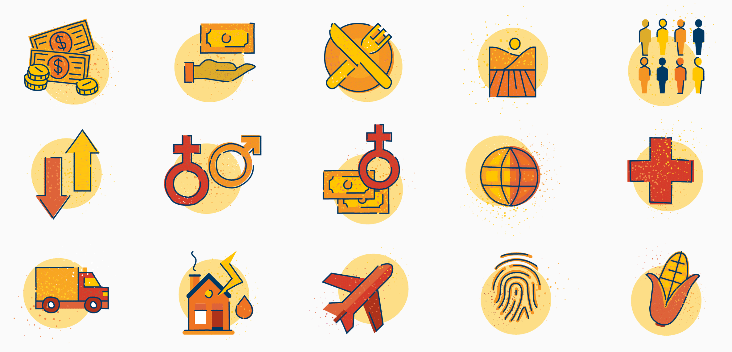
ILLUSTRATION STYLE APPLIED TO VISUAL ASSETS
A set of icons has been created in Adobe Illustrator using a defined palette of colours. The colours can easily be switched to make the icon set country specific. The illustrations have a hand drawn feel and are layered with organic textures.
INFOGRAPHICS
Infographics have been created to distill important data from the greater text and express it visually in the introduction of each report. The illustration style was applied to create beautiful infographics that were later used to promote the published research findings on social media platforms.


DATA PRESENTATION AND CHARTS
The data rich content includes multiple charts and graphs which were given a consistent visual treatment that made them easy to understand. The styling of the graphics is in keeping with the overall page design through the use of colour and typography. All elements in the design come together on the page to create a visually engaging and informative user experience.


NEXT STEPS AND LEARNINGS
This report-series design project is on going as more research is compiled for publication. On publication, the reports are made available online in the UNCDF MAP library.
Working with dense research materials and source documents, that are often 100 pages or more, can be challenging and overwhelming. A well organised process is imperative. To manage this project a detailed design system has been created. This system incorporates all type, colour, grid and illustration style requirements in granular detail and has ensured consistency across all outputs and made the design process efficient and economical.