
Upping Your Elvis
Written by Chris Baréz-Brown, this book is filled with life wisdom and motivational writing. The text is accompanied by original illustrations and creative typography that come together as a book that is a joy to read, again and again.
PRIMARY TOOLS= INDESIGN + ILLUSTRATOR
DURATION = 12 WEEKS INCL EDIT + PROOFING
CHALLENGE
The brief for this book was more than just design and typesetting, but also included project management. The manuscript was handed over by the client as a Word doc and needed to be edited before the real design could begin. I contracted an editor who was chosen based on her ability to capture the author's voice. We then worked closely to finalise the text content. In the interim, sample pages were designed to give the client a sense of how I envisaged the visuals and text coming together on the printed page.
As soon as the sample design was approved and the text finalised, the fun began. The design intention was to create spreads that communicated the content, and felt unique and engaging.

ILLUSTRATION + DESIGN
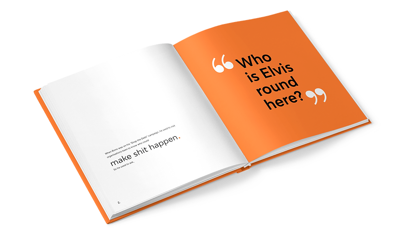
The illustration style used for the book is spontaneous and playful, with the feel of paper cut-outs. The content of the illustrations is based on the text content. While intentionally conceptual and sometimes even cryptic, the visual aspect of the book adds a layer to the content rather than just representing it literally.
A very simple 2 column grid system was used for the type design which allowed for flexibility and creativity. No two pages are the same, yet the design of the book is beautifully cohesive.
PRINT PRODUCTION
Once proof-read and approved by the client, the book pages were finalised for print.
As designer and project manager, I liaised with the printer about production specs. The book is printed with two spot colours on a natural uncoated paper. The cover is case bound with a white foil.
The cover design is boldly minimalist and intriguing. The simple three dots on the cover are echoed in the typography on the book title page. The dot continues as a design motif, used creatively throughout the book.


THE FINAL DESIGN PRODUCT
The finished book has been very well received and the design style has influenced the greater Upping Your Elvis brand styling. The illustrative style and quirky type design has become signature to their visual identity in their corporate communication as well as on social media platforms.
